As you might have heard Land O’Lakes, makers of that butter in your fridge, have recently decided to change their logo and packaging graphics. Removing the Native American woman from the front of their products for the first time in almost a hundred years.
Now I’m not here to talk about the politics of this situation. I wanted to know what kind of effect this sort of packaging design change could have on a brand. I did some digging and found some examples to explore it.
Firstly, let’s take a look at a success story.
Do you recognize this product? I’m guessing you don’t. It wasn’t super popular during its first three years on the shelf.
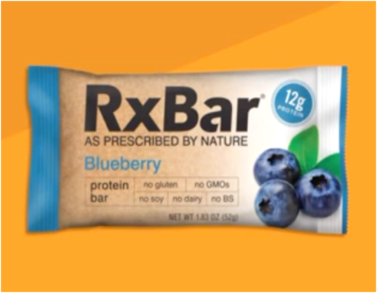
How about this one now? This one? I always recognize. In my opinion, it is one of the most unique and recognizable packaging designs on the market right now.
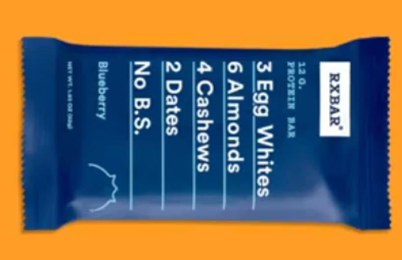
so how big of a success was this redesign? Well, in 2014, our x-bar in the original package managed two million dollars in sales. In 2017, with the new package they racked up a hundred and sixty million dollars in sales. Same product, different packages turns out people do judge a book by its cover.
In 2017, another huge brand Chobani also decided it was time to change packaging design up.
Despite being the world’s leader in yoghurt market share, the overall yoghurt market wasn’t performing very well. Chobani was starting to become indistinguishable on the shelf from a sea of competitors. The new design decided to focus on feeling artisan man-made and natural. The newer muted colors rustic font and hand drawn images really give Chobani a premium aesthetic. That once again allows it to draw your eye in the store.
Lastly let’s take a look at a redesign that didn’t go so well.
In 2009, Tropicana decided that they wanted to rebrand themselves through their packaging. They dumped the iconic orange and straw for a glass of juice and changed some of their verbiage as well. The result consumers were not happy and sales dropped 20% in just two months. There have been numerous case studies done on this redesign and the general consensus seems to be that the new branding created mixed message with the old packaging and the new graphics made the brand looked cheaper than it did previously. That being said learning from our previous failures is what makes us who we are and ten years later Tropicana is stronger than ever. Could this packaging redesign work out for Land O’Lakes? It might. Time is really the only thing that will tell.
Want more information about packaging, please check Samspackaging.com. We are happy to share with you all the knowledge about packaging.